Wednesday 21 April 2010


Introduction

We have been asked to create a music magazine of our choice for our Media Studies Coursework. The magazine can be how we would like it to be, and we must create our own personal band, which we can use in a photo shoot for a range of pictures within our magazine. We needed to create a Front Cover, the Contents Page and also a Double Page Spead. We also needed to show the things we had researched into, questionnaire and results, flat plans, drafts, and everything else we included in the production of the final copy of our magazine. The beginning process of my magazine starts from the oldest post, and ends on the latest post (excluding this post) which is the evaluation


(Final Draft of Cover)


(Final Draft of Contents Page)


(Final Draft of Double-Page Spread)

Monday 19 April 2010

I am pleased with the overall outcome of my magazine, although there are possibly a few things I could do to make my magazine more professional, if I was able to have more time creating the magazine I believe I would have had chance to do this, for example, I would of changed the background on my front cover to something instead of the white and black stripes, I would of done this so that my style would not clash with this background, also, I would of used Adobe Photoshop more effectively in cutting out the members of the band to put onto the new background, that is if I had more time or used time more effectively. If I’d of made these modifications I believe that there would be a better outcome of the overall magazine, as it would look more appealing to the audiences, which originally I had targeted as a 16+ audience, I believed this worked well as the stories I had chosen could be related to that of what a 16 year old and above would want to do, such as ‘Top 10 Gigs’ which would allow them to see which gigs would be more appealing to them as this is the time when generally most people would go to gigs and concerts as they will have more spare time than an adult. Although, there are sections to the magazine also which would appeal to the more adult audience such as interviews with band members, and a band biography, these would also tend to appeal to the teenage audience also. I believe I could have done more on my double-page spread, also, as before I would of done this if I had more time/worked more efficiently, I would of added more detailed to the article giving more information to the reader about the band and I would of said more things to make it more interesting, although I am still pleased with the outcome of the double-page spread. However, I am most pleased with the outcome of my contents page, I believe this was the best part that my magazine, I had spent most of my time on the contents, this is where I was losing time for my double-page spread, and also editing the front cover more to make it better, I believe on the contents I have used the colours well, as well as the use of the pictures which I had took, also the pictures I took fitted well with the contents page. Also, I believe that the magazine I have created sticks to the most popular choice of music style as shown by my questionaire, which was indie/rock.
This is my magazine doube-page spread, I had originally tried to base the layout and content of my spread from the two double-page spreads seen earlier by NME although, they are not very similar, however, it is quite similar to the first double-page spread shown with 'The teenagers' as the style seems quite similar. I am quite impressed by the outcome of my double-page spread as it looks well done, although I believe I should of added more information to it, and also some quotes to make it stand out further to the reader, making it more appealing for them to read. However, the bright yellow colour does make parts of this article stand out to the reader, for example the tour dates and also the biography of the band member, this would get the reader interested and drag their attention to these sections getting them interested in the article, which would mean they would want to learn more and read the other sections of the article which do not stand out so much compared to the bright yellow. I have stuck with the house style I have created on this spread followed on from the contents page and also the front cover of my magazine. This, makes the writing easy to read as it is clearly visible from the black background, and also it is visible in contrast to the yellow background, so the reader should have no difficulties reading the article. I have used original images again in correlation to the profile of each band member, each biography section is linked to the picture beneath, meaning that the picture below is the band member that has been talked aabout in the profile. Also, the image above the largest piece of text shows that that section is about both members and not just one of them, Ithink that this is used effectively.


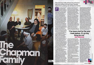
These are two double-page spreads from NME, these are what I've tried to base my double-page spread on.
When it came to finding a font for the masthead of my magazine, I found it quite difficult to do, I wanted to find a font which was not too plain, and I wanted to find one which was also quite large so that it would stand out from the rest of my background, the font I decided to use was called ‘Sumo’, which is where I got my initial idea for my magazine masthead, as the one I had before did not really work. After trying out this font , and other fonts on www.dafont.com I found that this was the most suitable font to choose, although there were many other options which I could of used, however this one stood out to me and I believe it worked out well as it was what I wanted. Another font I was thinking of using was ‘Bin’, however I do not believe this one worked effectively so I chose to stick to the ‘Sumo’ font.


For the inside content of my magazine, I was unsure of what exactly I was looking for, I wanted something which was easily read at a small font, yet also it had to stand out from whatever background I used on that page, I also wanted the text to look good so that the magazine would look more professional. I did not use a website to find what font I wanted to use this time as it took too long to find a suitable font for my masthead, so I used one of the default fonts on Photoshop which I thought was suitable. The font I used was Berlin Sans FB Demi as this was the font I found most effective and stood out from the background, while still being at a small print, I used this font on all pages on the inside of my magazine.
This is the contents page for my music magazine. This, I believe, is the best part of the magazine which I have done, the colours I have used seem to go well with eachother and all the writing is easy to read, also the use of the original pictures which I have took go well with the way the contents page looks, also the contents page seems full of information, with no unnecessaryblank spaces. This would give the reader the impression that the magazine is full of content, making the magazine look like it has alot of information and musical knowledge, giving a positive connotation to the reader. I am pleased how well the purple and yellow worked together on the contents, I believe here it has been used most effectively compared to the cover and double-page spread, also as you can see from my contents you can see that I have took some ideas of the contents from the NME magazine.


Tuesday 23 February 2010


When doing my contents page, I did not know what type of layout I should use to present my contents, using http://www.google.co.uk/ I searched a popular magazine to try and see what type of layout they had used, the magazine contents I was looking for was the one for NME. When researching the contents the layout of the contents page appealed to me, so when coming to make my magazine I used a similar layout taken from NME, however I tweaked it a bit to make it my own, and add things which were not added to their layout, and I also chose to remove some features which they had presented on the original contents. One feature which I had added was the 'Charts Top 10!' and also the editorial. Overall, I am pleased with the outcome of my contents, and I believed I had used the structure NME had used well, with several changes, giving it a professional look.